Wednesday, January 19, 2011
Exit Strategy Required for Cosmococa-Programa in Progress, CC4 Nocagions
Sunday, January 16th, we went to Suprasensorial: Experiments in Light, Color, and Space at the Geffen Contemporary at MOCA. When I found this exhibition at MOCA I was so excited to bring my one-year-old through it. She really got into Between Bodies/Tijuana by Nina Waisman, an audio installation at the 2010 California Biennial at the Orange County Museum of Art we experienced a few months ago. And she just started swimming lessons at the YMCA two Saturdays ago, so I thought Hélio Oiticica and Neville D'Almeida's Cosmococa-Programa in Progress, CC4 Nocagions (the one with the pool) would just be the coolest thing ever.
MOCA's website seemed to emphasize the logistics of using the pool so it seemed like they really wanted people to swim to complete the piece. I searched everywhere for a report of someone's actual experience swimming in the pool as part of this exhibit. I found nothing. I just trusted that when they said they'd have towels and
changing rooms they'd really have towels and changing rooms. I figured as long as I packed our swimsuits, it would be totally doable.
After experiencing all the other pieces, we finally arrived at the staging area for piece and it looked promising. They had a lovely stack of clean towels and dressing stalls as private as any clothing store. There were other families in the pool. A lifeguard was on duty. We had our suits. No problem.
So we changed into our swimsuits and went into the installation. There were little cushions on the deck along the edge of the pool to sit on. So I sat on one of the cushions with my child in my arms with the idea that I'd scope out the pool and then get in. Well, the cushion sort of slipped so I slid into the pool, landed on my feet just fine, with my child in my arms. A little more of a surprise entry than I had hoped for, but no big deal.
The water was as warm as the Y's heated pool. It was really shallow (90 centimeters as described in the information about the piece I'd read beforehand). The floor and sides of the pool are a slippery plastic that reminded me of the bottoms of above ground pools when I was a kid. But with a little care, I managed not to slip in such a way that might imperil my child.
We did our front glides and our back float just like in swim class, but in a dark room in a pool with blue lights around it while slides of John Cage's musical scores covered in cocaine cycled on the wall all to the music of John Cage. Sounds weird, but my child totally dug it. She was actually way more into it than she was into swim class the day before. The lifeguard was really friendly and complimented us for coordinating our blue and green swimsuits with the blue and green lights in the
installation, which was somewhat intentional on my part. I felt like I had done this literal immersion of my child in art really well.
Then it was time to get out of the pool. My child was easy. Her dad had a towel and I handed her up to him. No problem. Also, no ladder. No stairs. No grab rails. No nothing to help you get out of that pool. But it's only 90 centimeters deep, right? Well, the water is only 90 centimeters deep, but the side of the pool actually extends about another foot and a half. So that's about four and a half feet. I'm 5'7". Now, I've jumped out of the side of a pool before, but it's
actually easier if the pool is a little deeper because you've got buoyancy on your side, and I am nothing if not buoyant. But in only three feet of water, you get no help from buoyancy. The height of the pool was too high for me to get my arms under me sufficiently to pull myself out. I will also concede that my upper body strength is nonexistent.
So I jumped off the slippery bottom of the pool and pushed myself up with my arms as far as I could go. I leaned over onto the deck as much as I could. The edge of the pool was hard, sharp, and non-slip, so it was pretty tough to shimmy up even when I got my upper body onto the deck. Then I tried to throw my leg up onto the deck. I gave it my best shot about four times before the lifeguard hoisted me from the top and some totally random and quite probably very sketchy dude pushed me from the back and very slowly extricated me from the pool.
In addition to the glaring, but rather temporary humiliation (which I'm furthering by retelling this story as often as possible), I suffered some SERIOUS bruises on my tummy and leg.
The moral of the story: when you immerse yourself in art, you need an exit strategy.
If you're in the L.A. area before the show closes February 27th, my daughter and I highly recommend you go. Next Suprasensorial will travel to the Hirshhorn Museum and Sculpture Garden in Washington D.C., where it will be on view from June 23 through September 11, 2011. Be sure to pack a swimsuit and work out an exit strategy.
Labels:
summarized
Tuesday, February 2, 2010
Art Museum Curators Super Bowl Bet
On January 29th All Things Considered had a neat interview with the curators of the Indianapolis Museum of Art and the New Orleans Museum of Art regarding a Superbowl bet in which the loser will loan an artwork to the winner for three months.
Wednesday, December 2, 2009
Museumology
As most of the art we see these days is in museums, I hope this post about museums doesn't veer too far off the topic of art history.
Back on November 20, 2008, Edward Rothstein's review of the newly renovated National Museum of American History appeared in the New York Times. One part of his critique particularly stuck in my craw,
Moreover, the Smithsonian Institution can be considered a Wunderkammer, the NMAH being one part of a larger, even more diverse, and in Rothstein's view incoherent, whole consisting of over 136 million objects.
Meanwhile, All Things Considered has a series about museums. First, a piece on the history of museums. The second installment focuses on the director of the Virginia Museum of Art.
Back on November 20, 2008, Edward Rothstein's review of the newly renovated National Museum of American History appeared in the New York Times. One part of his critique particularly stuck in my craw,
. . . [T]he installation of 400 objects from the museum’s collection mounted in 275 feet of display cases in the new spaces [relies more on sensation than explanation and exploration]. It is an array of curiosity cabinets loosely organized by subject, with items like an 1870s surgical set, a Kodak Brownie camera, and a set of Vietnamese manicurist’s tools. The objects fascinate, but the miscellany is so deliberate, it is as if variety itself were the subject.To the extent that Rothstein complains about the lack of information provided with objects in museums, I heartily agree. The dearth of signage trend has been noted in the National Museum of the American Indian's sculptural collage of artifacts without any notation of their origin as well as the Georgia Aquarium's over reliance on volunteer docents in lieu of any signage at all - a post-literate museum. However, I find any complaint about the diverse array of seemingly unrelated objects reveals more about the reviewer's ignorance of the history of museums than any failing on the part of the National Museum of American History. The National Museum of American History's presentation of an eclectic collection of esoterica harks back to the precursor to the museum, the wunderkammer.
Moreover, the Smithsonian Institution can be considered a Wunderkammer, the NMAH being one part of a larger, even more diverse, and in Rothstein's view incoherent, whole consisting of over 136 million objects.
Meanwhile, All Things Considered has a series about museums. First, a piece on the history of museums. The second installment focuses on the director of the Virginia Museum of Art.
Saturday, April 4, 2009
Watts Towers & Pique Assiette
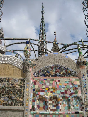
Friday my friend April and I went on a field trip to the Watts Towers created by Italian immigrant Sabato "Simon" Rodia. Rodia was a tile layer by trade. He used the same technique on his towers as Antoni Gaudi used in Park Güell in Barcelona: Pique Assiette which is the application of decorations by embedding carefully chosen shards and objects into drying mortar during the building process. You can also see examples of this technique on the exterior of the American Visionary Art Museum in Baltimore.
Unfortunately, the towers are currently under renovation so we couldn't go through the sculptures, but we got a pretty good view walking around the exterior.
The director of the Watts Towers Arts Center was incredibly enthusiastic and friendly and in all ways awesome. She was genuinely sad that we came at a time that their gallery was between exhibits, so she more than made up for it by introducing us to one of the artists, Augustine Aguirre, who was dropping off or picking up a box full of wire sculptures that looked like butterflies. We missed some show!
April noticed these sunglasses hanging between the scaffolding and one of the three towers. Could it be a member of the restoration team added his own piece of ephemera to the sculpture?
Hearts are a prevalent motif in the sunken relief as well as in the free-standing sculpture. Rodia immigrated to Pennsylvania with his brother who died in a mining accident shortly thereafter. Later he married and had three children, but the marriage ended badly and Rodia never spoke to his ex-wife again. Perhaps this recurrence of love lost explains the frequency of the figure of hearts in his work. Now, for the Heart of Watts Project, R. Judson Powell creates unique, handcrafted glass mosaic hearts, inspired by the Watts Towers and the heart motif that is scattered throughout them.
Labels:
summarized
Wednesday, April 1, 2009
Nefertiti's Face Lift
My partner in A(rg)H discovered this excellent article over at AOL News (who knew that was a source for this sort of thing?) regarding the discovery that a bust of Egyptian Queen Nefertiti was altered between its first and final draft. The article includes a quite thorough gallery of images.
Monday, March 16, 2009
Color Theory Update
I recently updated my Color Theory Index to include another artist focusing on color theory.
Via Dear Ada I found artist Sarah Charlesworth's Concrete Color series, a beautiful set of photographs with color theory as their subject matter. Googling the title of each piece could provide a seminar's worth of color theory. For example, Googling "Ostwald Triangle" led me to ColorSystem.com's amazing page about German chemist and color theorist Wilhelm Ostwald.
Wednesday, December 17, 2008
Egypt on Route 66
A nugget from KPCC's local news coverage that I thought might supplement our vast knowledge of ancient Egyptian art: Egyptian artifacts exhibit makes exclusive appearance in Southland by Steven Cuevas.
Just FYI, I believe the transcript of the interview between Cuevas and Eva Kirsch, the curator responsible for the exhibit at the Robert V. Fullerton Art Museum at Cal State San Bernardino, got confused with the material of which the beads in the world's oldest dress are made. It's our old friend faience, like the famous blue hippo, not "ionz."
Subscribe to:
Posts (Atom)